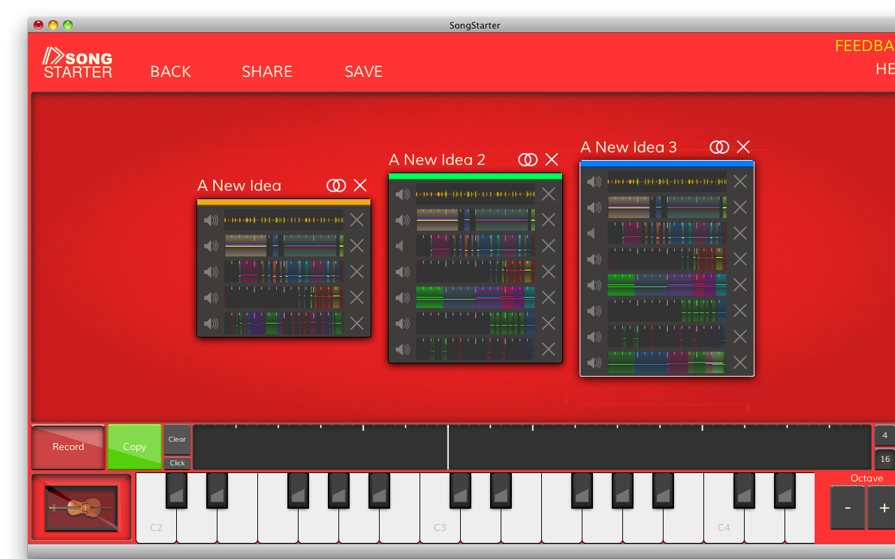
I’ve been playing around with tweaking the layout and graphics for loop groups (“ideas” in SongStarter lingo), and here’s what I’ve come up with:
The new layout makes it harder to accidentally delete loops, and the mute buttons now have a proper icon. Additionally, I toned down the colours by making the background a dark grey, and made each group identified by just a strip at the top (instead of a solid background color).
One major constraint in the graphic design for loops and ideas has been the waveform/note canvases. We have nice multi-colour waveforms, but they only look good against a black background. Unfortunately, a black background clashes with SongStarter’s otherwise vibrant appearance, so we have to compromise.
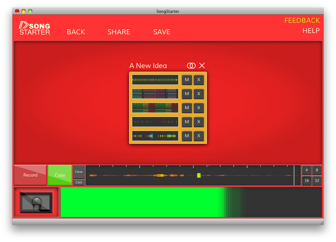
In the old layout (below), we had a solid, colour background for each idea. However, I think it emphasized the blank space in each idea, and provided perhaps too much contrast with the note/waveform canvases still. On the other hand, they matched SongStarter’s bright appearance fairly well, and I liked that they were unique. (I’d like to think that interesting colours stimulate your brain a bit more than boring greys.)
So, the new graphic design in the first screenshot isn’t perfect, and it’s still a compromise, but it’s a different compromise. I think it looks a bit more professional, helps make the note/waveform canvases look better, and still looks enticing.
Is it better? Leave a comment and let me know what you think!


